A Simple Guide To Getting Started with Your Kentico Xperience Online Marketing Platform: Part 2— Content Personalisation

A big step in increasing website visitor engagement is to provide a personalised experience. I don’t mean that the home page should address the visitor by their first name, ask how the family is doing, then proceed to discuss the philosophical topic from the previous session. That would be unnerving…

A personalised experience should sing to the type of visitor who is viewing the website. A chef would have a far better user experience if they were served content pertaining to the culinary world, as opposed to exercise equipment. This is where the power of contact segmentation shines — it allows us to isolate our audience so as to be able to target them with techniques such as serving personalised content. In part one of this series, we set up a specific persona: Victoria.
In this part two, we will look at how we can configure our website to give a website visitor in the Victoria persona a better, personalised experience compared to that of a first-time visitor. If you missed part one of this series, be sure to head over and check out how easily Kentico Xperience lets us manage website visitors by way of contact segmentation. And remember, a website visitor is referred to as a contact on planet Kentico, so we will use the term contact going forward.
In this guide, we will look at personalising the home page (figure 1) of our online store — Fashion Trends.
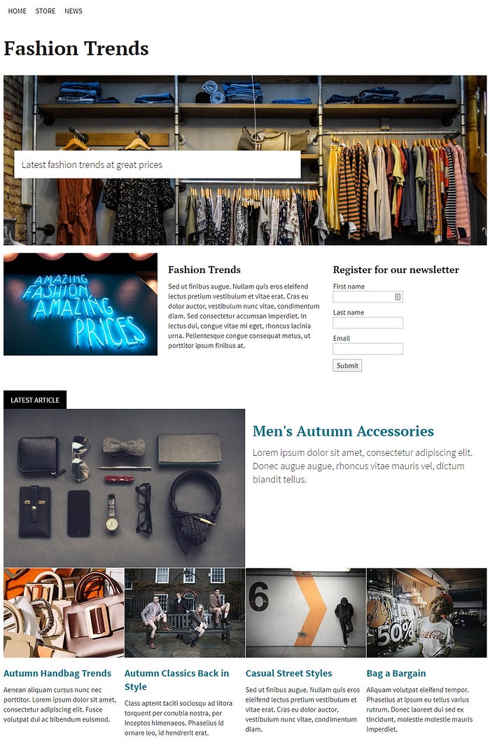
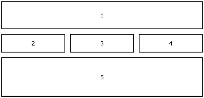
In figure 2 below, we can see that our home page can be broken down into five specific zones:
- Banner
- Advertisement
- Message
- Form
- News
We are going to personalise each of the five zones specifically for the Victoria persona contacts.
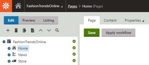
In the Pages application within Kentico Xperience, our home page is utilising the page builder functionality (see figure 3, below). For reference, this is an exciting addition to Kentico MVC which provides the ability to, among other things, implement widgets and configure widget and widget zone settings. Those familiar with the Kentico Portal Engine should feel right at home.
Zone 1: Banner
First up is the banner. Our website has a banner widget zone set up, which is using a banner widget. Currently, every contact sees the same banner, regardless of what persona or contact group they are in. We are going to update this banner zone and add a persona-based variant.
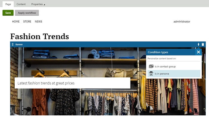
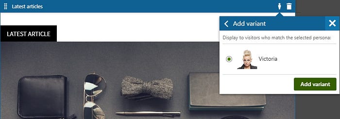
Adding a variant is easy, we simply select the variant button which brings up the condition types selector in figure 4. We can select to either base our variant on a contact group, or on a persona. For our example, we choose persona as we want to give Victoria contacts a specific banner.
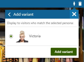
The variant selector lets us choose which persona we would like to add a variant for. If we had several personas defined, we could repeat this process for each persona, but in our case we only have Victoria.
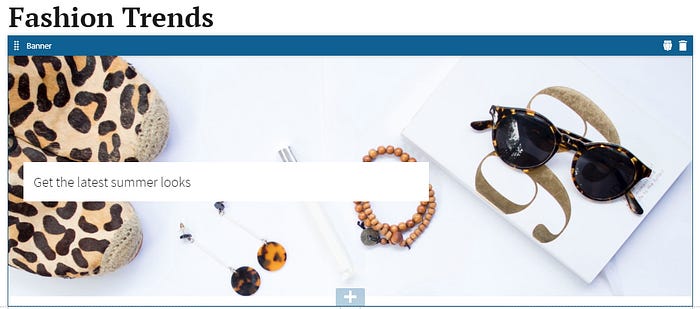
The last step is to upload a new banner image, change the tag-line, save the page and we are done. Whenever Kentico detects the site visitor is a contact of the Victoria persona, the system will serve that specific banner variant.
One down, four to go.
Remember that in part one of this series, we defined the Victoria persona as a window-shopper; Victoria contacts have the intent to purchase a product, but are generally hesitant to do so and don’t end up going through with a purchase. As such, part of the marketing campaign is to entice the contact to make a purchase. We will use the next three areas: advertisement, message and form, to help the contact make a purchase.
Zone 2: Advertisement
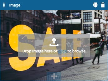
The advertisement area contains a widget that allows an image to be added, similar to the banner. This is the perfect area to add advertisements which can be regularly updated. As you can see from figure 1 above, we currently have a generic message telling our audience that the fashion here is amazing as are the prices. For the Victoria contacts however, we will advertise the upcoming sale to which they will have exclusive early access. Let’s create a variant and update the advertisement.
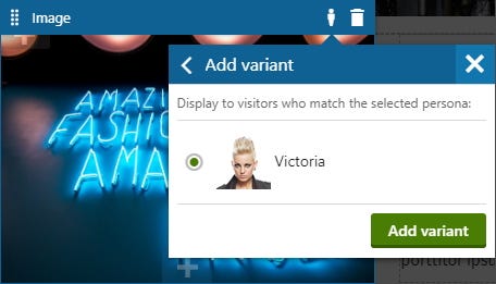
As with the banner in zone 1, we select the variant button which brings up the condition types selector, we choose persona, then we select Victoria (see figure 7). Lastly, we simply update the image by uploading our advertisement — the sale promotion.
Zone 3: Message
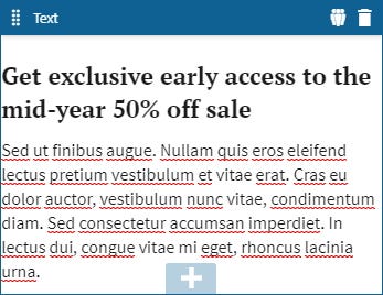
The next zone we will update is the message, which sits between the advertisement and the form sections. The message zone contains a text editor widget which lets us add free-text with basic styling. If you can read lorem-ipsum, the standard message pertains to the Fashion Trends website welcome message, but to tie this in with the sale early access for Victoria contacts, we will adjust the messaging accordingly.
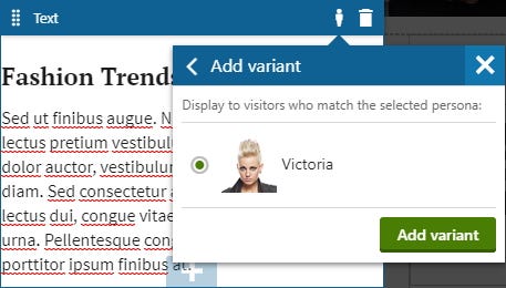
Again, we create a variant based on a persona, Victoria, and update the content to reflect the messaging around exclusive early access to the upcoming online sale.
Zone 4: Form
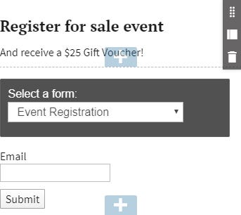
Lastly, we will update the form zone from the current newsletter subscription form, to an event registration form. By registering for the event, contacts will receive a $25 gift voucher which they can use during the early access online event.
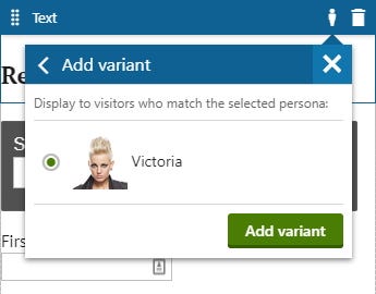

The form zone is made of two widgets: the form heading and the form itself. As such, we create a variant for each widget as per figures 11 and 12. Figure 13 shows the updated widget zone.
Zone 5: News
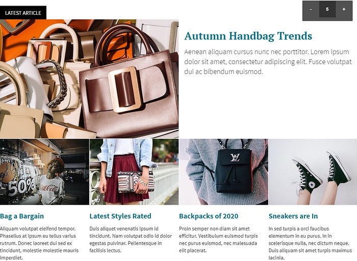
The final home page zone we will target is the news section. The home page displays top latest five fashion news articles and the selection is from the pool of all articles under the news section within the content tree (see figure 14).

We will create a variant of the news article widget to point at the /news/womens-fashion/ path instead of the /news/ path.
The resulting widget variant now only shows the articles under the new path — specific the demographic pertaining to the Victoria persona.
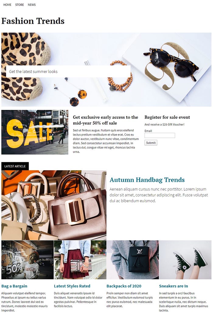
We have now updated all five zones on the home page. Finally, we are ready to see our home page as it looks when visited by a Victoria contact. The home page now appears quite different to the original, it is clearly marketed at a specific demographic and includes a special offer.
This is just the tip of the iceberg as the potential for content personalisation if far greater than 5 home page zones. Content personalisation can be used throughout the site, a journey can span several pages aided by call-to-action components. The advantages of creating a personalised experience to your segmented audience makes for a far more engaging experience.
In the next part three of this series, we will look at the third and final part of our overall campaign, the EDM (Electronic Direct Mail) — the humble email newsletter.
3-Part Series Quick Links
A Simple Guide To Getting Started with Your Kentico Xperience
Part 1 — Audience Segmentation
Part 2 — Personalisation
Part 3 — Email Campaign
